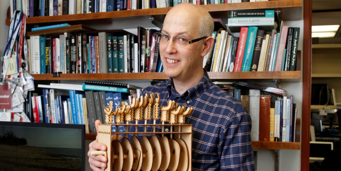
Atop a packed bookcase in the office of David Schneider, PhD, chair of Stanford's Department of Microbiology and Immunology, sits an assortment of odd little wooden contraptions.
Schneider's research on infectious diseases and their effects on infected hosts generates lots of data, which is where the contraptions come in: Sometimes it makes more sense for him to plot that data in more than two dimensions. He calls his creations data sculptures.
Getting sick and recovering are two different sides of a circular journey, Schneider says. “The path you take back to health isn’t the path you take getting sick. It’s a loop,” he told me when I interviewed him recently for an Inside Stanford Medicine feature on his data-sculpting acumen.
Take malaria, for example. You might want to give one patient antimicrobials but merely rehydrate another, depending on what phase of the disease cycle each is in. To treat a patient most efficiently, that is, it would be great to know when the patient got infected. But that’s somewhere between tough and impossible.
“We can’t expect a child suffering from malaria to tell us when they were bitten by an infected mosquito,” Schneider wrote in a study published in PLOS Biology in 2016.
In that study, Schneider’s group monitored malaria-infected mice. The researchers monitored changes, over time, in the blood levels of nine different cell types and immune-signaling substances as they first got sick and then recovered or, if they got too sick, were euthanized. The ratios and absolute levels of those measured cell types and substances wound up telling the researchers just where a mouse was along the looping path from health to sickness to recovery or death, and how likely it was to die barring further intervention.
Analyzing the same ratios and phases and rates of the rise and fall of those substances and cell types in human patients may make it possible to figure out where in the disease/recovery cycle a patient is. As I noted in my article:
The hope is eventually to be able to predict early on whether a patient is headed for recovery or not and, if not, how to best treat the patient based on where he or she is in the disease cycle.
Nine is a big number, though. “If you’re measuring nine things in a sick animal or person, it’s hard to graph, not to mention grasp, all nine variables at one time,” Schneider told me.
So he built a data sculpture. As you'll see in the photo above, it looks like a wooden rotisserie holding wooden pieces of “toast.” The “rotisserie” is actually an open-front box. Its “skewer” is a long wooden axis running horizontally from one side of the box to the other side. The axis can be turned via an externally positioned crank.
The thin pieces of toast skewered inside the box are in fact slim disks, each irregularly shaped in its own particular way, that act as cams. Each cam approximates a circle whose radius keeps changing at different points along the rim. A cam's radius at any given point on a disk's edge represents the level, at a particular point in the sickness/recovery cycle, of one of the nine cell types or substances Schneider’s team measured in malaria-infected mouse blood.
Astride each of the nine cams sits the figure of a man’s torso. The men form a line along the box’s top. When you turn the crank, they variously rise up, raising their arms to the heavens, or they sink down, arms back at their sides, as each is displaced idiosyncratically by its underlying, oddly shaped cam.
“It looks like a wave, moving through the data over time,” Schneider said. “You might have missed that if you were looking at numbers or a graph.”
Photo by Paul Sakuma


