
The best and worst part of coping with a relative's illness as a medical student is that I know just a little bit about medicine.
Only a few months into school, I got a call and learned about a new disease - not from a lecturer, but from a loved one. "Aren't you glad I'm making med school more interesting for you?" my relative joked, as my heart sank into my stomach.
I spent the following days and weeks trying to familiarize myself with the pathophysiology of the disease, to little avail. I Googled and read with the aid of my textbooks and still, I felt like I was drowning in a sea of medical jargon I haven't yet learned and uncertainties I'll never be ready to face. To quell some of the uncertainty, I sought out Kaplan Meier curves.
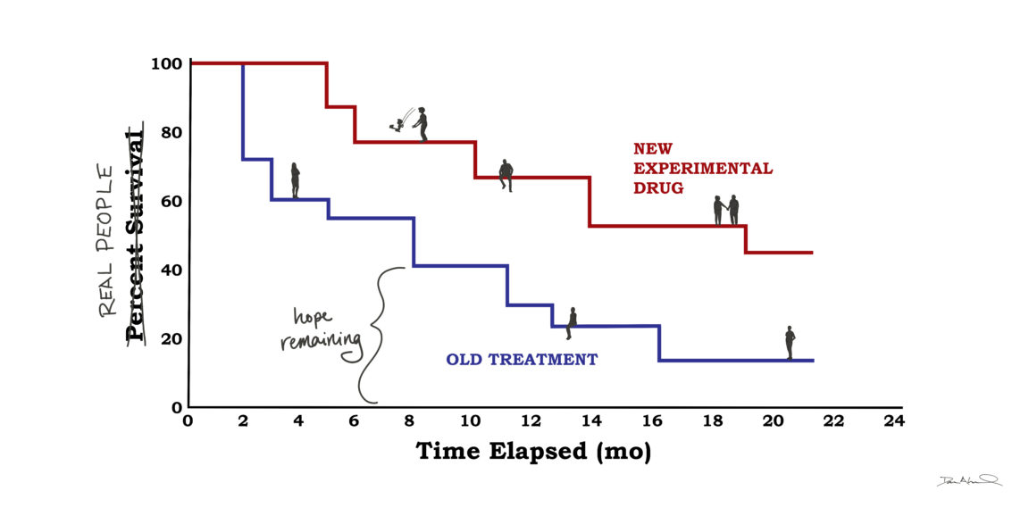
Kaplan Meier graphs estimate patients' disease progression or survival over time. They usually consist of two curves that look more like a set of descending staircases: They both start at a 100 percent survival rate, with the steps lowering over the years as the disease advances or as patients die. One staircase reflects the old treatment, the other shows the new. The best outcome for a clinical trial is that, with the new and improved regimen, the staircase will level out a bit, flattening as more patients enter remission.
I spent the hours that I should have been studying staring at these graphs. They appeared so definite with their sharp edges and numbered axes, but they represented so much uncertainty - reducing individuals to tic marks and colored lines. As hard as I looked, I couldn't see my loved one on there. I couldn't place their unique health history, sources of support, or access to care. In fact, I couldn't see anyone on there: no stories or hobbies or careers, no faces or personalities dotting the lines.
A few weeks after the phone call, my relative was still searching for the right course of care. I continued to read papers and sent some desperate cold emails to Stanford Med faculty, and received warm and generous replies. I kept a list of the drug names being considered on my phone, noting which physician recommended which treatment plan.
One day during this period, I sat in an immunology review session. The lecturer flashed a Kaplan Meier curve up on the projector, showing a different disease being treated with one of the drugs I had recently added to my list. I saw two curves dropping dramatically over the course of months, but the curve representing the new treatment was slightly less steep - patients on the experimental drug remained healthier for a little longer. I looked at this graph with the same sadness I felt every time I pulled up the graphs depicting my own loved one's disease.
"Isn't that amazing?" a classmate whispered to me. "How unreal is that difference?"
Taken aback, I nodded, unable to mutter even a few words in response. My classmate saw a treatment that could make an awful illness a little less awful. I envied his optimism, but I saw something else. This drug could delay disease progression by a matter of months for only a small fraction of the people who took it. How could he ignore the graph's hopelessness in all its unpredictability?
With a little hindsight, I still believe that the graph was far from rosy. It did reveal a kind of progress that, despite its limitations, deserves recognition. But the people behind the graph deserve our recognition as well.
Every day, as we students memorize facts about symptoms and outcomes, we're also reminded by our professors that patients are more than their illnesses, more than their statistics. They tell us this in lectures and show us this in clinics because, as obvious as it may seem, it's too easy to lose sight of the whole person - in all of their human complexity - as we attempt to identify and analyze their broken parts.
When looking at the arc of a Kaplan Meier curve, it's also far too easy to forget that every downward step corresponds to a person who got sick, and then, somehow, got even sicker. And when they did, someone who loved them probably stood by their side, holding back tears. Going forward in my training, I won't be able to forget that fact, I won't stop seeing the faces behind the graph - but truth be told, sometimes, I wish I could. "Isn't that amazing?" I'd ask, seeing the curve's hopeful uptick - instead of its frightening, unpredictable descent.
Illustration by Dana Leonard
Stanford Medicine Unplugged is a forum for students to chronicle their experiences in medical school. The student-penned entries appear on Scope once a week during the academic year; the entire blog series can be found in the Stanford Medicine Unplugged category.
Orly Farber is a first-year medical student from Washington D.C. She graduated from UChicago in 2015 and spent the following two years in an allergy lab at the National Institutes of Health. While Orly's heart remains in Chicago, her body is thrilled to be in the Bay Area! She loves running, hiking, rock climbing, baking bread, and tending to her plants -- fully embracing the West Coast lifestyle.